


Sometimes it’s not in your client’s best interest to give them exactly what they want.
We’ve all been there when you say you want one thing, but you’re unintentionally meaning another. What you need is that expert opinion to translate what it is you think you want, into what it is you really need.
Take these images below as an example.
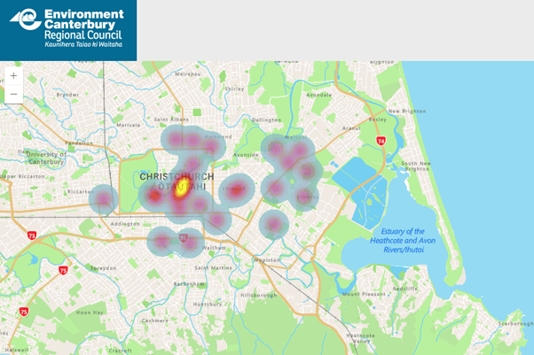
The first map is showing density data, the second, intensity data.
When a client recently asked me to produce a heatmap of water quality concentrations, I would have given them the wrong thing if I produced a heatmap as the output.
A heatmap is used to show the density of points in a given area without necessarily needing to show the value of a particular point. It is great for presence/absence data where you need to identify hotspots in a landscape where more points (occurrences) appear closely together. Heatmaps also work especially well with citizen science data, such as with:
- Native bird sightings
- Invasive species sightings
- Natural hazard incidents
The ECan heatmap from February 2026 shows the presence of any odour smelt by Christchurch residents due to the recent issues with the wastewater treatment plant. Areas in darker red and yellow show a greater number of instances where odour had been noticed.
The term ‘heatmap’ can be used colloquially as a catch-all phrase to describe a map with coloured ‘hotspots’ or gradients to draw the viewers attention to a particular area. However, a heatmap technically refers to a specific data modelling and visualisation technique used mainly for density data.
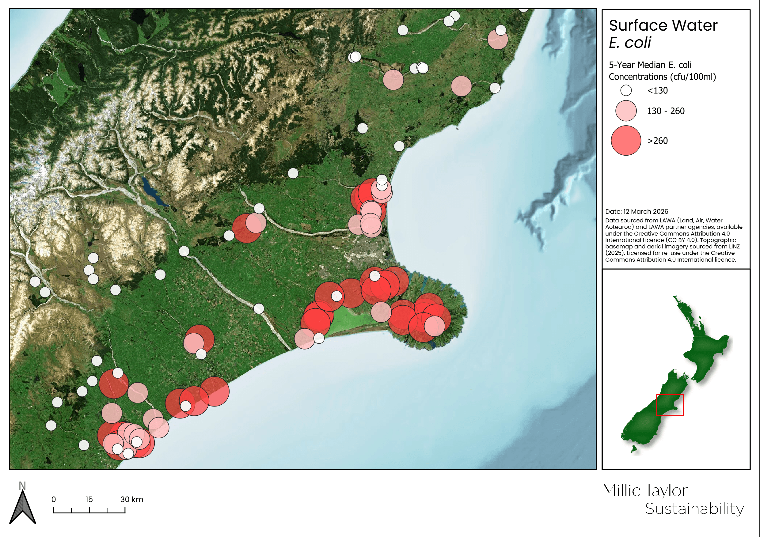
In the case of water quality however, I knew what the client was trying to achieve when they asked for a heatmap of water quality concentrations. Working with the water quality data to show areas of high and low concentration, I instead displayed the point data as symbols gradually increasing in size and colour to simulate the heatmap effect – the main goal of which to draw attention to areas of higher concentrations. This type of symbology works best for point datasets which have a value associated with them, such as:
- Air quality concentrations
- Water quality concentrations
- Earthquake magnitudes
Recreating this same effect in the second map and using LAWA water quality results as an example, you can quickly identify areas of higher median E. coli concentrations. Combining size with colour in a graduated format – larger and darker coloured circles for higher median E. coli concentrations – is an effective way of representing intensity values of environmental data across a landscape.